TURN-UP
B2C
Web-App
UI
Helps deliver local produce to consumers interested in supporting local agriculture
_pn.png)
TURN-UP
Turn up is a platform that helps connect consumers interested in buying local produce with local farms, where they can have the transparency of what farms have to offer, and have local produce be easily accessible and delivered to them.
ROLE
Product Designer
User Research,
TIMELINE
3 Week Sprint,
Feb 2020
MOTIVATION
A B2C Passion project
TEAM
Nelson Diaz- UI Designer
Katherine Chester- UX Researcher
Exploring The Problem
THE PROBLEM
There was a problem with how can local farmers better connect with their communities, and how can consumers access local produce? There was a lack of accessibility to local produce.
PROPOSED SOLUTION
We thought the initial solution to that problem was to create an app that brings small-scaled farms to online platforms to help consumers support local agriculture and help small-scale farms get exposed to the business.
We started by conducting a competitive feature analysis to find where we can better provide the most value and stand out.
LOCAL

DELIVERY
PICK-UP
NON-LOCAL
Comparators
Competitors
01 Few competitors offer local produce with reliable delivery dates that fits to users needs.
02 Major grocery delivery services lack transparency of where they get their local produce.
Area of Focus
There were two sides to the problem, the local farms POV and the consumer’s POV, We decided to focus on the consumers POV for this sprint as it will fit within the project timeline and user recruitment will be less time-costly
TARGET AUDIENCE
Our target-user where consumers who want to buy local produce and support local agriculture, we made sure to recruit users who met the criteria, we looked for users who use grocery delivery services and users who buy local produce.
01
Screener Survey
16 Participants
02
Interview
5 Users
03
Synthesize
Pain points & needs
Synthesizing
Data
Persona Development

EVE, 30
GOAL
Support her local community vendors and have the convenience of grocery delivery.
NEEDS
Transparency about what farmers have to offer.
PAIN POINTS
Does not have easy access to farmers markets.
Design Challenge
How might we help Eve buy from local farms
without sacrificing the convenience she receives through delivery services?
Ideation
What'll turn up solve?
01 Turn-up will bridge between local farms and consumers so they become easily accessible.
02 Turn-up will help
farmers meet the demands of today's online growing consumers.
03 Turn-up will help consumers support their local farms without sacrificing convenience of delivery services.
Design Studio
Outcome
After several rounds of design studio, we were able to bridge between research and design we were able to decide on the best solution based on Eve's needs.
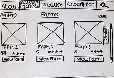
Farms Landing Page
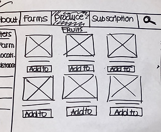
Produce Landing Page
Guest Checkout

INSIGHTS
The tasks given to users were completed successfully, but we noticed some observations contrary to the what the user's expressed
Usability
Insights
01
02
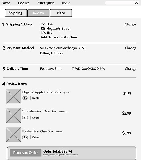
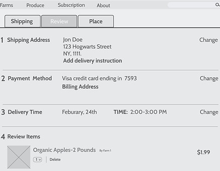
Checkout wire-frame in mid-fidelity
01
User were confused by the tabs at the top, and didn't make sense of where they were.
02
User's priority was to see delivery times and availability before entering all information.
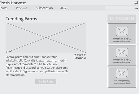
MID-FI
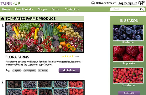
HIGH-FI
CHANGES MADE:
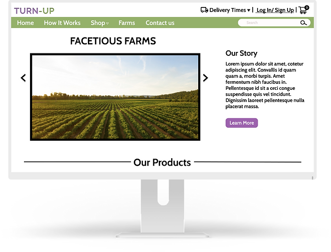
01 Added easy access to delivery times in the utility navigation as users expressed that this is the deciding factor for purchasing.
02 Added home page to the primary navigation and added relevant page content that users searched for, the primary navigation content will need a card sort testing later.
MID-FI
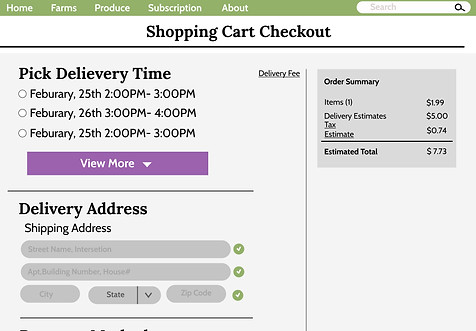
HIGH-FI
CHANGES MADE:
01 Prioritized delivery dates to be on the top of the checkout process before filling out information as the users have expressed they don't want to go through the effort of filling information if the delivery time is not suitable for them.
02 Iterated to fit all checkout sections into one page rather than tabs, and have the order summary on the right corner when filling their information.
Iterations
Based on our findings and observations from our usability testing, we iterated it in our mid-fidelity and made necessary changes
CHANGES FROM MID-FI TO HI-FI
We incorporated usabilities best practices like providing users instant feedback into our high-fidelity iterations along with the insights gathered from Mid-fidelity.
Developer Hand Off
After finishing our high-fidelity mock-up, We translated our design into UI detailed specifications doc for it to be ready to hand-off to developers.
USERS INTERFACE HAND-OFF
After finishing our high-fidelity mock-up, we started working on the user interface specifications document

- Disabled state /field
- Pill buttons [tags]
-Illustration elements
-Secondary Navigation
- Active state
- Drop down button
- Illustration icons
- Titles
-Main text content
-Headlines
-Sub titles
-Background color
-Field color
-Text color for buttons/ headers/filters/ primary navigation

-Accent color hover
-Background color for headers and titles.
-CTA buttons
